Category Archives: Cornish Heritage Farms

Holiday Wrap Part I

Along with creating coordinating envelopes as we did yesterday, I really enjoy designing gift bags, gift card holders, etc.  Here is my first of this holiday season.  (Probably the first of many!)  I don’t know if they will all be this easy, but this one came together in a snap!

Merry & Bright

              M&BGS4

The Thomas Kinkade Christmas papers made this one an easy task.  The papers are 8″ x 8″ and my bag just happened to be 8″ wide.  It’s so nice when things work out like that!

I repeatedly stamped “Silent Night” onto a piece of white snowflake patterned paper from M&BCU5the pack, then added the velvet ribbon along the seams. 

I applied Diamond Stickles to the trees, ground and house.   You can see the sparkles a bit better in this smaller picture.  (Still not as sparkly as in person though.)

To mat the sentiment on the card, I punched two ovals (the same size as the white sentiment piece) and overlapped them behind the sentiment.  It works well enough if you don’t have the next size up punch for matting.  (Note to self:  MUST get more Nestabilities!)

Thanks so much for stopping by!  Have a great day!

Stamps:  Cornish Heritage Farms “Christmas Expressions” (Mona Lisa MomentsInk:  Ranger Frayed Burlap Distress   Cardstock:  Prism Tawny Medium   Patterned Paper: Cornish Heritage Farms “Christmas Series Thomas Kinkade Paper Pack”   Accessories:   Velvet ribbon by May Arts, Diamond Stickles by Ranger, oval punch by EK Success.  Card size 4 ¼” x 4 ¼”.

It’s a Match!

When time allows, I love to make matching envelopes for my cards, so Julia’s challenge today was perfect for me!  We’re using envelopes. They can be incorporated into your card or project, or you can make a matching envelope to compliment your card.  If you’d like to play along, you can find the challenge info here.

Hello

      HCME

I used Sweet Spring, one of Kim‘s new releases available today. (  Sorry, it’s just SO cute…one of my favorites of all of her releases!  If you like spring, little chicks, bunnies and soft cuddly sheep, you must check it out!) 

I stamped each chick twice onto the solid HCCU“patterned paper,” adhering one full image to the stamped white cardstock, then cut the second pieces, leaving off a wing on each chick and adhering those with pop dots. 

My original intention was to line the envelope with the green floral paper, but I only had two small pieces left.  Instead I matted one strip of the patterned paper onto the dark Birchtone cardstock, scalloping one edge with my Fiskars Rotary Trimmer and scallop blade.  I stamped the little chick in the corner along with the little row of flowers he’s about to pick. 

Thanks so much for stopping by!  Enjoy your day!

Stamps:  Cornish Heritage Farms “Sweet Spring” (Kim Hughes Collection)   Ink:  Tsukineko Memento Tuxedo Black   Cardstock:  Prism Birchtone Dark, Super Smooth White   Patterned Paper:  Basic Grey Sugared   Accessories:  Copic markers, ribbon, safety pin, clear 3-d gel pen by Sakura, Fiskars Rotary trimmer/scallop blade, Spellbinders Nestabilities, button, glue dots, pop dots.

Spell it Out

I’m always excited to get the new Kim Hughes releases and this month was no exception.  She has three new sets available Thursday, Sweet Spring, Number Fun and Playful Alphabet.  The spring set is sweet as can be, but I was especially happy to see the alpha set.  I often wish I had a certain word or sentiment, but  now I can easily make my own!

Love Ya!

 OFP

Here I used the spring and alpha sets with my favorite new patterned paper, Cosmo Cricket Chemistry.  (LOVE the bold colors!)  I added a bit of a shadow around the letters to add some depth but it’s hard to see in this photo.

Hoppy 1st Easter

1stESTR

The bunny, flower and “Hoppy Easter” are from Sweet Spring and the number one and “st” are from Number Fun.  There are also block numbers in the set that can be colored in for a bolder look. 

I paper-pieced the bunny, placing a pop dot between the two layers to add depth, placed another pop dot under the left flower and added a bit of Fun Flock on the bunny’s tail.

I’ll be back with more! 🙂  Thanks so much for stopping!  Have a great day!

Love Ya!  Stamps:  Cornish Heritage Farms “Playful Alphabet” and “Sweet Spring” (Kim Hughes Collection)   InkAdirondack Pitch Black by Ranger   Cardstock:  Prism Suede Brown Dark,  Natural Smooth   Patterned Paper:  Cosmo Cricket Chemistry   Accessories:  Copic markers, brads (American Crafts), trim and ribbon (source unknown), Fiskars Rotary Trimmer/scallop blade, pop dots.

Hoppy 1st Easter   Stamps:  Cornish Heritage Farms “Sweet Spring” and “Number Fun” (Kim Hughes Collection)   Ink:  Adirondack Pitch Black by Ranger   Cardstock:  Prism White, Super Smooth White   Patterned Paper:  Imaginisce “For Peeps Sake”   Accessories:  Ribbon (Making Memories), jewels (Doodlebug Design), clear 3-d gel pen (Sakura), Copic markers, white Fun Flock, Quickie glue pen, (Sakura), sewing machine, pop dots.

Monday, Monday

TGIM!  Today’s challenge at Cornish Heritage Farms is to use backgrounders.  I don’t know about you, but all the gorgeous patterned paper available today has made me a  lazy stamper.  I used to love backgrounders but now…I still love them, I just don’t use them very often.  When I DID use them, I especially liked tone-on-tone so that’s what I decided to do here.  (And I’m going to try to use my many backgrounders more often.)

Once in a While

       OIAWFT

I chose non-traditional wedding colors and used a new backgrounder, Flowers and Lace.  I stamped Adirondack Oregano onto Prism Birchtone Medium cardstock.  I used the same ink to stamp the silhouette of the couple (stamped off once first), then overstamped the sentiment with black ink.

I added a teeny-tiny pearl in each scallop and a slightly bigger one in each corner.

Be sure to check out these other CHF designers to see how they used their backgrounders:  Julia, Dawn, Joanne, Kristine, Carole, Mona and Kim.

Up next are samples using three new Kim Hughes sets (to be released this Thursday).  Thanks so much for stopping by!  Have a great day!

Stamps:  Cornish Heritage Farms “I Thee Wed” (Kim Hughes Collection), “Wedding Centers” (Mona Lisa Moments), “Flowers and Lace” backgrounder   Ink:  Adirondack Pitch Black and Oregano by Ranger   Cardstock:  Prism Birchtone Medium and Dark, Natural Smooth   Patterned Paper:  Daisy D’s “Snowflakes & Holly” 6×6 paper pad   Accessories:  Marvy (oval) punches, EK Success Ticket Corner punch, pearls (Michaels).

Thankful Thursday


Julia’s challenge today is to use a theme of thanks.  It can be a Thanksgiving card or just a “hey, thank you”  kind of card or project.  I chose a set I received a while back that hadn’t yet seen ink.  Better use it now before it’s too late, eh?  A lot of dust can collect in one year’s time.  🙂

Thankful

      Thankful3

I used Let’s Get Stuffed from the Kim Hughes Collection.  I stamped the image onto natural cardstock, colored with Copics, cut it out and adhered it to a block of the “solid” patterned paper.  I didn’t have enough room to tie the knot and have the focal panel lie flat so I punched a little slot, threaded the ribbon through and then knotted the ribbon.  It’s an easy way to make things fit sometimes.

Stamps:  Cornish Heritage Farms “Let’s Get Stuffed” (Kim Hughes Collection)   InkAdirondack Pitch Black by Ranger   Cardstock: Prism Suede Brown Dark, Natural Smooth   Patterned Paper:  Basic Grey Infuse   Accessories:  Copic markers, ribbon

I hope you all have a fabulous Thanksgiving!  I’ll be spending my day with family and friends…eating.  🙂  Seriously though, I have so much to be thankful for…my family, friends, health, I’m thankful for you guys who come back here to see what I’m up to and to read my ramblings.  Any one of these things can be taken away in just a moment.  I truly appreciate all I have while I have it.  Thank you SO much for stopping by!  Big hugs to all, and have a great day! 

A Thanksgiving Noel

I had a moment this morning to play along with this week’s sketch challenge at Splitcoast Stampers.  It’s been a while…I miss having time for that challenge.  It’s my favorite.  (Actually, I should be cleaning for company tomorrow, but shhh….I couldn’t resist.)

Noel

OFP

I pulled out my favorite Christmas patterned paper for this one, Basic Grey’s new Wassail.  I got mine at Jacksonbelle Embellishments.  (From today through Monday you can get 20% off your entire order using code THANK08.)

I paper-pieced the trees using a solid paper from the Wassail paper pack and popped up the heart (also paper-pieced) on a tiny piece of a foam square.

Ok…now I’m off to clean. 🙂  Thanks for stopping by!  Have a great day!

Stamps:  Cornish Heritage Farms “Heart Warmers” (Kim Hughes CollectionInk:  Adirondack Pitch Black by Ranger   Cardstock:  Prism Birchtone Dark   Patterned PaperBasic Grey Wassail 6×6 paper pad   Accessories:  Basic Grey brads, foam square, sewing machine.

Vintage Hugs, More Sickies and Twilight (the movie)

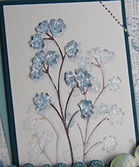
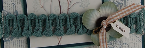
Hi everyone!  TGIM!  Today’s challenge at CHF is a wordy one.  We’re to use big words, little words or both.  As you can see, I chose one tiny little word.  (Sometimes, that’s all you need.)
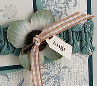
Hugs

OFP

I used Ranger’s Weathered Wood Distress ink for everything but the  flower stems and the tag.  I wanted to add a bit of dimension to the flowers so I stamped them a second time onto a scrap of vanilla cardstock, cut them out, distressed the edges a little and adhered them over the other flowers.   I also added a bit of shading with a gray Copic.

For a bit of sparkle (which I know you cannot see here), I added some Shimmerz paint to the flowers.  Angel Wings is the only color I have right now, but I hope to get more at some point.  I’ve decided I love that stuff!

I created the background using two of CHF’s backgrounders, Canvas and (new) Ornamental Vines.

Be sure to check out these other CHF designers to see how they used their words:

Dawn, Carole, Kim, Joanne and Lesley.

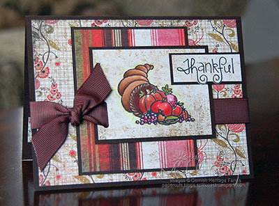
Stamps:  Cornish Heritage Farms “Nature Silhouettes” (Kim Hughes Collection), “Everyday Petites” (Mona Lisa Moments), Ornamental Vines and Canvas Backgrounders   Ink:  Ranger Weathered Wood Distress and Espresso Adirondack   Cardstock:  Prism Island Mist Dark and Light, Natural Smooth   Accessories:  Brown Marvy marker, Making Memories “Passport” trim, Prima flower, Michael’s ribbon, Basic Grey button, Shimmerz Angel Wings paint, gray Copic marker, sewing machine, safety pin.

SO…(change of subject), I had plans to see Twilight on Saturday.  I almost didn’t get to go.  (Gasp!)  Earlier in the day I had taken my son to a friend’s house to play.  The mom opened the door, greeted us with a friendly hello and my son promptly puked all over her doorstep (slightly embarassing).  Obviously, we came right back home.  THANKFULLY my husband told me I should go ahead and see the movie with my friends.  (Even though there was a chance he’d have to deal with sickness? Really? I took about one second to think about it.)  So I saw the movie.  YAY!   

I thought some parts seemed a little “low budget” and I was a bit disappointed with a few things, but overall I loved it.  (I went in with very low expectations since I loved the book so much but it was definately worth seeing.)  I did laugh when I saw Carlisle.  For one thing, I expected him to be a little older (I don’t know why), but I definately didn’t expect him to be so white.  Holy cow.  That dude was pasty!  And I thought Edward didn’t need to look quite so creepy at times.  I realize these guys are vampires but aren’t they supposed to “blend in”… somewhat? 

When the movie was over, I didn’t want to leave.  I wanted New Moon to start right then and there.  So I’ve now bought the Twilight soundtrack and I started reading the story for the second time.  I’ve never enjoyed a series so much.  Love, love, love it!! 

If you’ve seen the movie, please let me know what you thought.  I’m curious to hear other opinions.  (Team Edward or Jacob?  It has to be Edward.  It’s just meant to be. And so complicated.  But I suppose life with a werewolf would be complicated too.  Warmer -lol- but complicated nonetheless.)  🙂

By the way, my son is back to normal.  It was just another one of those 24-hour things (a replay of last weekend with my daughter).  And in case you’re wondering, he waited for me to get home from the movie before he puked some more.  (Lucky husband.)

Thanks so much for stopping by!  Have a great day!  (Sorry to be so windy.  I just had to talk about the movie too.)

Minnie? Minnie Pearl?

Happy Thursday!  Today Julia’s challenge at SCS is to use pearls…Mother of Pearl technique, Perfect Pearls, liquid pearls, faux pearls, etc.  Since I had just purchased these little faux pearls from Michaels, and since I’d already stamped the cake and adhered the little babies in the circles, I thought I’d use that! 🙂  (Gotta love those head starts!)

So Happy For You

       SHFY2

My next problem though…what to do with the cake.  Some days I feel so creative, others…nada.  It comes and goes in spurts.   I get lots of ideas of what to do with stamped images, but when it comes to layouts, and sometimes even colors, I just draw a blank. 

I have a list of stampers (in my head) whose work I truly admire and when I’m getting no clue as to what to do, I check out their galleries or blogs for a little inspiration…or a lot of inspiration which was the case here.  This layout was heavily inspired by Cindy Haffner, a very talented lady who pops out awesome cards one after the other.  I don’t know how she does it.

I tried to fit a sentiment on the front but it just didn’t work out so it’s on the inside.  I’ve always thought cards looked kind of naked without a sentiment but I’m noticing more and more sentiments saved for the inside.  I’m beginning to really like that.  What do you think?  Do cards look naked without a sentiment?   

Thanks for stopping by!  Have a great day!

Stamps:  Cornish Heritage Farms “I Thee Wed” and “The Birds and The Bees” (Kim Hughes Collection)   Ink:  Adirondack Pitch Black   Cardstock:  Prism Suede Brown Dark, Natural Smooth   Patterned Paper:  My Mind’s Eye Wild Asparagus “Baby Girl” Dots/Light Pink Paper   Accessories:  Pearls by Michaels, Brads by American Crafts, piercing template/needle, ribbon by Morex, pop dots.

A Sad Occasion

Through blogging, we “get to know” those who share our interest in papercrafting.  I don’t share a lot of personal things on my blog, but I do have a blogging friend who often speaks of her friends, her dear husband and their adventures, her children and her mom.  I was so sad to pop into her blog the other day to learn that her mom had passed away.  My heart just breaks for her as I know she was so very close to her mom.  Of course I left a comment expressing my sympathy, but I wanted to make a card as well to let her know that I’ve been thinking of her.

He Leads Me

       HMMLD5a

This is one of my favorites of the Thomas Kinkade images.  I think it works for multiple occasions…wedding, anniversary, sympathy and more.

Here, I tried a little trick I learned from my friend, Julia.  I inked the stamp, then wiped a bit of ink away where I wanted to place the sentiment.  I used a baby wipe (just because that’s what was within my reach at the time) and it actually changed the color of the ink around the edges of the wiped area.  I’m not sure if I like that or not, but the idea of wiping away some of the ink is brilliant.  (Thanks, J!)

For the background (which I realize you can hardly see as I covered so much of it), I used a new backgrounder, Flowers and Lace, which will be available this Friday, November 21st.

When I asked my husband if he liked this card, he said, “It’s alright.”  Silence.   Then, “It’s purple.”  Then I also realized it has a “crooked” layer so I probably just should not have asked.  (He’s an engineer.  Everything should be straight.  And centered.)  I think my friend will like it, but now what if she hates purple… 

Thanks for stopping by!  Have a great day!

StampsCornish Heritage Farms “Streams of Living Water” and “Still Water” (Thomas Kinkade), “Flowers and Lace” backgrounder   Ink:  Color Box Wisteria Chalk   Cardstock:  Prism Majestic Purple Light and Dark, Natural Smooth   Accessories:  Button by Tim Holtz, ribbon by Morex, sewing machine, baby wipe, Glue dots.  Card size 5” x 5”.

It’s a Sparkly Kind of Monday

TGIM!  🙂  It’s been a few weeks since I’ve been able to play along with the Monday challenge at Cornish Heritage Farms.  I’ve missed it!  This week’s challenge is to use Sakura pens.   (You can find the challenge forum here if you’d like to play along.)

Bee Mine

            BM2

I used a new set, The Birds and the Bees, from the Kim Hughes Collection.  I have the worst time photographing anything that sparkles.  I even have one of those photo tents with the big lights and I just cannot seem to capture shine.  It’s so aggravating.  You can see it a little better in this close up:

           BMCU1

I used a yellow glitter pen for the front and back of the bees, black on the black parts, and orange and gold on the striped bee.  On the wings I used a clear glitter pen.

BMCU2I wasn’t quite satisfied with the bees flat on the oval, so I stamped and colored them again, cut them out and mounted them over the first set using pop dots.

Bee (ha, ha) sure to check out these other CHF designers to see how they used their Sakura pens:   Julia, Dawn, Carole, Kim.

Thanks so much for stopping by!  Have a great day!

Stamps:  CHF “The Birds and the Bees” (Kim Hughes Collection)  Ink:  Adirondack Pitch Black by Ranger   Cardstock:  Prism Super Smooth White, Black   Patterned PaperBasic Grey Urban Prairie   Accessories:  Sakura glitter pens, Oval punches by Marvy, Slot punch by EK Success, Ribbon, Pop dots.