Monthly Archives: February 2008

A Manly kind of Valentine

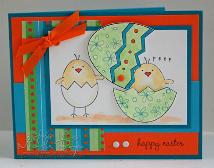
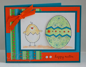
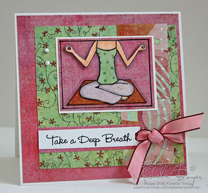
Happy Valentine’s Day!  Anybody have any special plans?  We usually just do a little something extra for each other, nothing fancy or expensive.  This is my little something.   

HVD2I tried to “fancy it up” a bit with my presentation.    When I saw the crisscross box here, my first thought was that it could look like a shirt or a robe over pajamas, so I thought I’d make one a bit fancier, to match the wine bottle. 

For the candy bar holder, I followed the pattern and directions from the link above but I adjusted the size to fit the candy bar.  To do that, I laid the candy bar at the top center of my only sheet of black 12 x 12 cardstock.  (The top of the candy bar aligns with the top of the paper.)  I said a little prayer that I didn’t mess up, checked and double-checked, and I scored along each side of the bar, adding in just a smidgeon of extra space.  After that, I pretty much followed the pattern.  The most trying part was worrying that I was cutting in the wrong places.  (The box doesn’t stand on it’s own.  I have some kind of freaky little Pokemon figure holding it up in the back. I can see the tip of it sticking out on the left. lol.)  I used a scallop blade in my Fiskars Rotary Trimmer to cut the little gold scalloped edges.  The “for you” from Cornish Heritage Farms‘ “So Happy” is gold embossed, as is the “Happy Valentine’s Day” on the card.  The larger black piece on the card is also stamped with the Burlap backgrounder but I know you can’t see that in the picture.  It just gives a subtle look of texture.

Thanks for stopping by!  And have a wonderful Valentine’s Day!

Cardstock:  SU Basic Black; The Paper Company Metallic Golden Luster   Stamps: Cornish Heritage Farms  The Rummage Bin “So Happy” and “Burlap” backgrounder   Ink:  Versamark, Brilliance Graphite Black   Accessories:  Ranger Gold ep, heat tool, scallop blade/Fiskars Rotary Trimmer, gold Morex organdy, Karen Foster antique thumbtack brads, pop dots.  Card size 5” x 5”.

Scrappy Wishes

We’re off to a late start this morning due to ice so I thought I’d take advantage of the extra time and do today’s sketch challenge.  It’s a good one!   This card came together pretty quickly (which is rare for me as I usually end up torturing myself over one thing or another).

BWR1I have a friend who shared some wonderful news last weekend, so I thought I’d send a card with my *best* wishes and congratulations.  I’m so happy for her I’m almost at a loss for words.  (I hope she likes “scrappy.”)

I pulled out some of my favorites here.  The patterned paper is from the Coppered Out Precious Metals line by We R Memory Keepers.  I used the reverse sides of most of the prints, but the one showing is my absolute favorite.

On the solid blue piece, I used the Canvas backgrounder by Cornish Heritage Farms.  After stamping the blue, I stamped the ivory piece without reinking, then sponged and distressed the edges.  The flowers (also from CHF) are from Silhouette Blooms I.  After inking the stamp, I stamped off onto the Canvas backgrounder, then used my waterbrush and cocoa ink to add a bit of darker shading in spots.  The swirls on the blue piece are from CHF’s new line, The Rummage Bin (the “Beautiful” set).

Thanks so much for stopping by!  Have a great day! 🙂

Cardstock:  SU Naturals Ivory (base only)   Patterned Paper:  WRM Precious Metals Coppered Out “Bloomin,” “Flourish” and “Crochet”   Stamps:  CHF “Beautiful,” “Silhouette Blooms I” and “Canvas” backgrounder   Ink:  SU Close to Cocoa, Ranger Walnut Distress   Accessories:  SU Chocolate taffeta, aged copper hodgepodge clip, edge distresser, sewing machine/thread.  Card size 5” x 5”.

Oh, Happy Day!

Hi!  I decided to try today’s color challenge at SCS…to use Tempting Turquoise, Green Galore and Kraft.  Interesting combination.  I never would have put these colors together, but I like the sharp contrast of the bright colors, especially when set off with black.

HDR3I am on a mission to use up some of this old Stampin’ Up patterned paper.  These stripes are from Dots & Dashes.  (I wish SU wouldn’t retire everything so quickly.)

The sentiment found it’s place at the top because when I was stamping the flowers on the car, the mask didn’t quite cover enough of the white paper and I ended up with a bit of a flower up there.  Oops!

I colored the image with Copic markers, trying my best to pick the closest shades to Turquoise and Green Galore.  I used the colorless blender pen to lighten parts of the car and the tires. 

I was feeling pretty layout-challenged today, so I settled for the three panels.  And just to add a little extra “something,” I popped them up just to be a little different.  The oval sentiment is popped up as well.

Thanks for stopping by!  Have a great day!  And just for the record, Kim made me (want to) use this stamp today.  Shoot!  I could have borrowed one of her layouts.  Why didn’t I think of that sooner? Next time!

Cardstock:  SU Tempting Turquoise, Black, Whisper White   Patterned Paper:  SU Dots & Dashes    Stamps:  Elzybells Art Stamps “Girl in Car” and “Daisy Trio” and A Muse Artstamps “Happy Day”    Ink: Brilliance Graphite Black, Bashful Blue (for daisy background)   Accessories:  Copic markers, black grosgrain, small and large oval punches, black brads, pop dots.  Card size 5 ½” x 4 ¼”.

Hello, Friend

Happy Monday!  I know a lot people dread Mondays, but I actually kind of like them.  It means the house is quiet, I can do the things that need to be done at my own pace and then do the things I *want* to do…or the other way around.  😉

HFCHF

I had a bit of time this weekend to play with my new stamps from Cornish Heritage Farms.  I just couldn’t wait to get back to the distressing and flowers.

I used Silhouette Blooms I from the Kim Hughes Collection, coloring directly on the stamp with Pretty in Pink, Pale Plum and Sahara Sand Stampin’ Up markers.  I stamped, then added a little more detail with the smaller tip of the markers, then added a bit of messy Close to Cocoa smudges using a water HFCUbrush.  Once the image was dry, I used a clear glitter pen to add just a bit of sparkle to the tiny pink flowers.  (To see the flowers in a bit more detail, you can click on the thumbnail.)  The brown background was stamped with  Canvas backgrounder in Cocoa ink, and the word “friend” is from Mona Lisa Moments Classic Essential Expressions.  Wow, are there ever a lot of useful phrases in that set!

In one of my previous posts, I was asked how I get my edges to look so “scruffed up.”  I use Stampin’ Up’s edge distresser.  I’ve never tried any other brand, so I can’t give a comparison but I do love the one by SU.  I like my edges to look kind of shredded, or maybe “frayed” is a better word.  To get that look, I lay the piece of paper on my thigh, lay one hand flat on the paper to hold it in place, then I scrape back and forth in little movements along the edge of the paper with the distresser.   So I don’t just drag the distresser along the edge.  I move it back and forth in short movements until I get the amount of distressing I want.  I hope that helps! 

excellentaward.jpg

I want to send a big thanks to Broni for rating my blog as excellent!  She’s so sweet!!  Thank you, Broni!  (She is *uber* excellent!!!)  …Can I just rate all those on my blog-hopping list? 🙂  So much inspiration!!

Thanks so much for stopping by!!  Have a great day!  (Don’t forget about Lindsey‘s sale through Tuesday!)

Cardstock:  SU Confetti White    Patterned Paper:  My Mind’s Eye Wild Asparagus “Happy Birthday” Floral, pink and brown papers    Stamps:  Cornish Heritage Farms “Silhouette Blooms I,” “Canvas” backgrounder, “Essential Expressions Classic   Ink:  SU Close to Cocoa   Accessories:  SU markers, ribbon, edge distresser, safety pin, clear Sakura Stardust glitter pen, water brush.  Card size 7” x 5”.

Forever Friends

It’s the weekend!  And I have no plans!!  Yay!  That doesn’t happen often so I’m pretty excited, so unless something strange happens, I plan to have a nice, relaxing couple of days!!

FFEB4With this last release of Elzybells, I decided to take the plunge and order a few.  I really liked the Winter and Holiday releases, but controlled myself and left them alone.  However, I thought the Friendship release was just too cute to pass.  (Plus, when my daughter saw them, she started screaming that “we” have to buy them…like I needed a little nudge.)

I made this card for one of my best friends.  She’s one that I *know* I will have forever…not that we stand around holding hands or anything…lol…but she is a wonderful friend.

I really like this Prima Baby Girl patterned paper.  There isn’t one sheet in the collection I don’t like.  I wanted to use the patterns to paper-piece the dresses but they were all kind of big for this small image.  So I used the insert from the packaging.  You know the little squares that show the different patterns that come in the pack? 

 PPBG

Those little squares are perfect for paper-piecing when you need smaller matching prints.   Another idea is to use the tags and such that come in some of the paper packs.  The patterns are often reduced on those as well (and I never use those as is anyway).

Thanks so much for stopping by!  If you feel like doing a little shopping this weekend, Jacksonbelle Embellishments has a sale of 25%-35% off until Tuesday!  You can help her move!   See what’s on sale here.  Also, she’s thinking of making some changes, so if you have a second, please answer this one question.  It’ll only take a moment and she’d really appreciate your input.  Have a great weekend!!

Cardstock:  Bazzill Bling “Diva”, Papertrey Ink white   Patterned Paper:  Prima Baby Girl “Lullaby” and “Delight”   Stamps:  Elzybells Art Stamps “Holding Hands,” A Muse Artstamps “Friends Forever”   Ink:  Brilliance Graphite Black    Accessories:  Copic markers, black SU marker, Queen & Co. “Miss Priss” mini sprinkle brads, SU Word Window punch, pop dots.  Card size 4 ¼” x 5 ½”.

Hey, Hey, We’re the Monkeys!

Good morning!  Wow, it’s been a super-busy week for me.  I can’t believe it’s Thursday already.  And still so much to do…oh well.  At least it’s “work” I enjoy!  🙂

JHR2These little monkeys are just so much fun!  They’re from a new set by C.C. Designs called Monkey Love, available Saturday at 10 p.m. from All That Scraps.  The stamp sets are now being packaged in CD cases-love that!!  Also being released are three new background stamps…Plaid, Hearts and Dots and they’re a full 4 3/4″ x 5 1/2″ (give or take a tiny bit).  Also, in case you didn’t know, there is now an All That Scraps blog!  Check it out here and scroll down a bit for their giveaway!

For this card, I used the new Plaid background.  I tilted the monkey stamp so he would look like he’s really hanging. The sentiment just fit in SU’s small tag punch.  It’s hanging from some oval Making Memories jump rings I’ve had forever.   The flowers are Bitty Bazzill Blossoms.  As I’ve mentioned before, I consider myself totally flower-challenged…I hope they look ok.  I’m never sure. (lol)  I added some tiny stitches here and there around the plaid background.  They’re a bit hard to see, but I thought it just looked too plain sitting on the dotted paper.

TH1This is my favorite of the two monkey stamps.  I love those out-stretched arms, just waiting for a hug. 🙂  I used the Heart background, faux stitching around the edges.  If I had brown thread, I would have machine stitched.  (It just would have been faster and I like the added texture of machine stitching on cards.) 

Thanks for stopping by!!!  Have a great Thursday!!  

Cardstock:  Bazzill Coconut Smoothies, Chocolate Chip   Patterned Paper: Doodlebug Choco Dot    Stamps:  C.C. Designs “Monkey Love,” “Plaid” and “Hearts” backgrounds   Ink:  Brilliance Graphite Black, SU Chocolate Chip   Accessories:  Copic markers, SU Jumbo antique brass eyelets, Bazzill Bitty Blossoms, American Crafts Chestnut brads, copper eyelet, small and large tag punches, mat pack/needle, Chocolate Chip marker, mm oval jump rings, linen thread, ribbon, black 3-d gel pen (eyes), Crop-a-dile, pop dots. 

Peep!

Wow, two posts in one day…that’s a first!  I had the last one planned, but then I really wanted to do the sketch challenge today at SCS.  (Trust me…the double posts will *not* become a habit. lol.) 

I’ve been trying to come up with something different for a workshop I’m having Friday night.  After a bit of a struggle with some coloring issues, I’m finally happy with the result. 

HEO425

I thought this set, A Good Egg, was so cute!  The egg top swivels open and closed, hinged by the orange brad.  Here’s what I did…I stamped the egg twice, coloring the top and middle on one, and the bottom only on the second.  I cut out the pieces, leaving the black line at the base of the crack for the top piece and the black line at the base of the crack for the bottom.  I stamped the chicks twice on the white cardstock, omitting the bottom of the chick on the right.  I placed three pop dots on the bottom half of the egg and adhered that over the colored chick.   I placed pop dots on the back of the top part of the egg but did not expose the second side of adhesive.  Those pop dots serve only to pop up the piece.  I poked a needle through the left dot (and through the pop dot on the back of that first spot), positioned that piece over the chick and then poked the needle through the hole and through the white cardstock.  After inserting the brad, I used my scissors as a spacer before tightening the prongs of the brad.  That way the brad doesn’t squish down the pop dot and the top part of the egg is able to swivel smoothly.  (I hope all of that made sense.)

Here’s what the card looks like with the egg closed.HEC300

Thanks so much for stopping by…again.  Have a great day!! 🙂

Cardstock:  Taken with Teal, Only Orange, Tempting Turquoise, Whisper White    Patterned Paper:  Dots and Dashes (retired)    Stamps:  A Good Egg, Karen Foster snap stamps (“peep”)   Ink:  Basic Black, Gable Green, Taken with Teal, Pumpkin Pie, Barely Banana   Accessories:  Tempting Turquoise and Only Orange markers, white gel pen, eyelet, Crop-a-dile, brads, ribbon, dimensionals, aquapainter.  Card size 5 ½”x 4 ¼”.  All supplies Stampin’ Up! unless otherwise noted.

Take a Deep Breath!

How many times have I said that to my kids?  Many!  And now they’re saying it to me.  Ha!  At least I know they hear some of what I say!  I knew I had to use this sentiment from the new set, Serenity Now, by My Favorite Things.  

TADBRAs usual, I paper-pieced the girl.  Now, I have a friend (I’m not mentioning any names…she knows who she is 🙂 ) who thinks it’s kind of freaky how I cut up all these little arms and legs and put them back together.  It never really bothered me until I was working with this image.  I cut the arms and chest as one piece and I will admit, it DID look rather bizarre with the arms stretched out, no body.  But it was all good once her parts were in their proper places.   🙂

After piecing everything together, I added some shading with a light gray marker.  Also, the arms are not attached to the paper to add a bit more interest to the card.

Don’t forget about the MFT New Release Cocktail Party at SCS tonight from 9-11 est.  The new sets will be released at 10:30.  Pop on over for some “twisted” fun and find out how you can be the next MFT Guest Designer.

Thanks for stopping by!!! Have a great day! 

Cardstock:  Papertrey Ink white   Patterned Paper:  Basic Grey Pheobe Paper Pad   Stamps:  My Favorite Things “Serenity Now”   Ink:  Brilliance Graphite Black   Accessories:  Copic markers, ribbon, Queen & Company white sprinkle brads, white gel pen.  Card size 4 ¼” x 4 ¼”.

Sending Love

I just don’t want to stop using these new stamps from Cornish Heritage Farms!  I hope you all don’t get sick of me using them!  It just seems like it’s been so long since I’ve had sets I can distress, rip, shred, make dirty (lol) and I’m loving it!  🙂 

LSBII480Here I used Silhouette Blooms II from the Kim Hughes Collection.  I used Chocolate Chip ink to stamp the flower onto a piece of solid paper from Basic Grey’s Periphery paper pad.  After stamping the flower, I used a waterbrush to add some True Thyme ink to the flower center, leaves and stem.  

A lot of the distressing was already on the paper, but I did shred the edges and add some sponging and faux stitching.  The patterned paper is also from Basic Grey’s Periphery paper pad.  (I love the reduced prints.)  After tearing the right corner, I sponged the edges of that piece as well, added the straight faux stitching up the side and the brads in the lower right corner.  The chocolate card base is stamped using CHF’s French Script backgrounder.  The focal image is raised on pop dots and the scrap of copper cord is just tucked into the knot (because I cannot seem to tie ribbon and cord at the same time).

Thanks so much for stopping by!  Tomorrow I will have a sample of the second new release by My Favorite Things, Serenity Now.   Have a great day! 🙂  

Cardstock:  SU Chocolate Chip    Patterned Paper:  Basic Grey Periphery Paper Pad    Stamps:  CHF Silhouette Blooms II, French Script backgrounder    Ink:  SU Chocolate Chip, True Thyme; Ranger Walnut Distress   Accessories:  Wide chocolate organdy, copper cord, mm copper brads, SU mat pack/needle, SU Chocolate Chip marker, waterbrush, pop dots, sponge.  Card size 5 ½” x 4 ¼”.

My, what big ears you have.

My Favorite Things is releasing two new sets Wednesday evening, one of which is Eggstra-Special Easter.   Aren’t those big ears adorable? 

HEMFTThe last time I was in my semi-local scrap store, I picked up some of this new patterned paper by Imaginisce called For Peep’s Sake.  (How cute is that?!)  Each paper has glitter on one side and a coordinating color/pattern on the other.   Of course I had to buy one of each…you’ll be seeing it.  🙂  I thought it was perfect for this stamp set!

I colored the bunny and the flowers with Copic markers, then added a touch of sparkle to the tulips and leaves with orange and melon Spica glitter pens.  I wasn’t sure whether I *really* needed those as I have other glitter pens, but these add just a touch of shimmer and they dry quickly, so I decided yes, I did in fact “need” them.  😉   And, as usual, I used a 3-d black gel pen on the bunny’s eyes and nose they’re shiny and raised just a bit.

HE150I used the ribbon to fill a bit of the empty space in the upper corner of the focal image.  Since there wasn’t quite enough room for the knot to the right of the image, I used SU’s slot punch so I could bring the ribbon over just a bit.  It’s a little trick I use often.  Sometimes you can’t even tell I’ve punched a hole as the ends of the knot will cover the area, like here and here.

The focal image is raised on pop dots to accommodate the ribbon underneath, and I added the brads in the corners just to add a bit more interest to the card.  (I like “stuff” on a card.)

Be sure to check out MFT’s Member Forum for additional details on the New Release Cocktail Party on Wednesday, February 6 from 9-11 p.m. est.  And find out how you can be the next MFT Guest Designer!

Thanks so much for stopping by! Have a great day! 🙂

Cardstock:  Certainly Celery, Papertrey Ink white   Patterned Paper:  Imaginisce For Peep’s Sake “Hot Chicks” and “Spring Fling”   Stamps:  My Favorite Things “Eggstra-Special Easter”   Ink:  Brilliance Graphite Black   Accessories:  Copic markers, slot punch, ribbon (Making Memories?), white brads, Spica glitter pens, Sakura 3-d black gel pen, pop dots.  Card size 5” x 5”.